Wednesday, November 20, 2013

BIVARIATE CHOROPLETH MAP

 
A bivariate map is a type of choropleth variables on a single map that strives towards illustrating a particular map though graphics that use different symbols to explain different information.
 
 
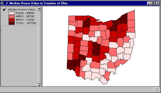
This map shows the median house value in counties of Ohio using 4 different colors.


UNIVARIATE CHOROPLETH MAP


A Univariate Choropleth map is a type of choropleth map that displays a single variable.


This map shows in 5 different colors, percentages of individuals, through out the U.S.

NOMINAL AREA CHOROPLETH MAP


This is a type of choropleth map that displays nominal data.  This map shows the minority group with the highest percent of state population.  It uses 5 different colors to represent different races.


ACCUMULATIVE LINE GRAPH OR LORENZ CURVE


Accumulative line graph or Lorenz curve is a graphical representation of the cumulative distribution function of a probability distribution. It was developed by Max O. Lorenz in 1905 for representing income distribution.  This map illustrates the % of income and % of households.

INDEX VALUE PLOT


An index value plot is a type of visualization map in which an index value, instead of an absolute value, is plotted on a line graph. This map shows the average stream flow index in North Carolina and ranged from mid February to the each of March. The average stream flow index is plotted based upon particular days of the week and the number value of comparison is 4.

BILATERAL GRAPH


A bilateral graph displays two or more related data sets through one of several means. This is a type of bilateral graph showing the relationship between Trainees, Experts, and JOCVs.


Tuesday, November 19, 2013

SCATTERPLOT


A scatter plot is a graph made by plotting ordered pairs in a coordinate plane to show the correlation between two sets of data.  A scatter plot describes a positive trend if, as one set of values increases, the other set tends to increase.  This positive trend is shown in the map below, as the days increase, so does the weight.

POPULATION PROFILE


This map shows the population of the State of Florida in the 2010 Census.  It also shows the cross sections of the land surface.  The maps title explains everything: population profile.


PARALLEL COORDINATE GRAPH


Parallel coordinates is a common way of visualizing high dimensional geometry and analyzing multivariate data.  A parallel coordinate graph charts coordinates or variables of data points on an axis. The different points are connected with lines across the axis.  Seen below, the values at the top of the Y Axis represent the League Leader while the baseline of the X Axis represents a zero value.

CLIMOGRAPH


A climograph map is a graphic representation of the relation of two climatic elements (as temperature and humidity) plotted at monthly intervals throughout the year.   This map of Manitou Springs, Colorado, shows the monthly precipitation and temperature.  The months of June and July are the highest.

TRIANGULAR PLOT


A triangular plot map gives the information in the form of a triangle.  For example, this map shows the components of soil: clay, sand and silt.

WINDROSE


 A wind rose is a graphic tool used by meteorologists to give a view of how wind speed and direction are distributed at a particular location. Historically, wind roses were predecessors of the compass rose, as there was no differentiation between a cardinal direction and the wind which blew from such a direction.

HISTOGRAM


A Histogram is a bar graph of a frequency distribution in which the widths of the bars are proportional to the classes into which the variable has been divided and the heights of the bars are proportional to the class frequencies.  A histogram is made up of columns plotted on a graph.   

This map shows the Monte Carlo simulation results.

BOX PLOT


 A boxplot is a convenient way of graphically depicting groups of numerical data through their quartiles.  Box plots may also have lines extending vertically from the boxes (whiskers) indicating variability outside the upper and lower quartiles, hence the terms box-and-whisker plot and box-and-whisker diagram.  This box plot shows machine and energy.


SIMILARITY MATRIX


A similarity matrix is a matrix of scores which show the similarities between two data points. They are generally used in sequence alignment. The higher the score the more similar characters it receives.


CORRELATION MATRIX


A correlation matrix shows a correlation between variables, as seen in the map above.

STAR PLOTS


A star plot is a graphical data analysis method used for examining the relative behavior of all variables in a multivariate data set.  This map analyzes 16 different makes of 1979 automobiles.

CLASSED CHOROPLETH MAP

 
CLASSED CHOROPLETH MAP

Classed choropleth maps portray data for states, counties, etc. and are combined into a smaller number of groups and portrayed in intervals.  This map shows the expenditure per dollars per pupil in North Carolina public schools for the years 1994-1995.

 This map uses 5 different colors to show the expenditures in dollars throughout the state.

INFRARED AERIAL PHOTO


Infrared Aerial Photographs are remotely-sensed maps.  The aerial photographs are satellite or airplane-based.  The types of exposures are, infrared aerial photo, as seen below, where the film emulsion is sensitive to infrared spectrum.  Another type of infrared aerial photo is the black and white aerial photo, where emulsion will record only visible spectrum.


Sunday, November 17, 2013

RANGE GRADED PROPORTIONAL CIRCLE MAP


This is a Range Graded Proportional Circle Map of motor vehicle deaths.  The smaller circle represents 7-907, while the largest circle represents 26,099.
This is a point pattern map, that uses a circle instead of a dot. 


CONTINUOUSLY VARIABLE PROPORTIONAL CIRCLE MAP


This is a type of point pattern map.  It uses a circle instead of a dot.  The size of the circle relates to measured variable.  There are two types of proportional circle maps: Continuously variable symbols (seen below) and range-graded symbols.
 

I love the colors on this one!


DIGITAL ORTHOGRAPHIC QUARTER-QUADS

 DOQQ
 
 
Digital Orthographic Quarter-Quads
 
DOQQ's combine the image characteristics of an aerial photograph with the geometric qualities of a map.  It is an aerial photograph that has been georeferenced and orthorectified. 


DIGITAL ELEVATION MAP


A DEM is a digital file consisting of terrain elevations for ground positions at regularly spaced horizontal intervals.  Notice the terrain elevations below in this DEM map of New Mexico.  DEM's may be used to generate three-dimensional images or colorized to bring out relief.


The DEM is a raster format, cartographic data recorded, stored, and processed in a cell, or pixel. 


DIGITAL LINE GRAPH


 A digital line graph contains a wide variety of information (for example, topography, hydrography, boundaries, roads, utility lines, etc.).  It is digital vector data.  Data about map features are stored as lines (arcs), points, and areas (polygons).


https://www.google.com/search?hl=en&site=imghp&tbm=isch&source=hp&biw=588&bih=319&q=DLG+map&oq=DLG+map&gs_l=img.3..0i24.1576.2703.0.3058.7.7.0.0.0.0.138.738.2j5.7.0....0...1ac.1.31.img..1.6.596.L-bs0b1HeCw

DIGITAL RASTER GRAPHIC


A digital raster graphic is a scanned image of a United States Geological Survey (USGS) standard series topographic map.  DRG is geoferenced and its features are tied into a coordinate system, a datum, and a map projection.


ISOPLETHS


An isopleth map generalizes and simplifies data with a continuous distribution. It shows the data as a third dimension on a map, thus isopleth maps are more common for mapping surface elevations, amounts of precipitation, atmospheric pressure, and numerous other measurements that can be viewed statistically as a third dimension.

ISOHYETS


An isohyet map shows rainfall.  Isohyet maps are a type of contour maps that use contour lines.  When contour lines are close together (see below), the change in the third dimensional variable is large over a very short distance.  Where the contour lines are spread apart, the amount of change in the variable is small.


ISOTACHS


Isotach map is a type of contour map. 
 
An isotach is a line on a map or chart connecting points of equal wind speed.


The wind speeds and directions are visible in this map.

ISOBARS


An Isobar map is a type of contour maps.  Contours lines, as seen below, are defined by a contour interval that tells you the amount of elevational change between contour lines.  The contour interval for a map is constant unless otherwise noted. 


LIDAR


This is laser-based imagery.  It utilizes laser pulses coupled to a global positioning system to develop highly detailed images of earth surface phenomena.
 
Notice all the pretty colors in this map!  Lidar is popularly used as a technology used to make high resolution maps.


DOPPLER RADAR


Doppler radar utilizes microwaves to track direction and speed of suspended water droplets in the atmosphere.  It also determines whether atmospheric motion is horizontally toward or away from the radar.  I like watching the map as it moves!
 
 
Doppler radar was named after J. Christian Doppler, an Austrian physicist, who in 1842 explained why the whistle of an approaching train had a higher pitch than the same whistle when the train was going away!


BLACK AND WHITE AERIAL PHOTO


Black and White Aerial Photo of the Brooklyn Bridge
 
 
An aerial photograph is a type of remote sensing.  The photographs can be divided based on the type of film.  Photographic film can be coated with different light-sensitive emulsions, each sensitive to specific wavelengths of electromagnetic radiation.  This photo of the Brooklyn Bridge is a black and white emulsion sensitive to approximately the same wave lengths as the human eye.


INFRARED PHOTO


This is a type of remote sensing.  Infrared emulsion is sensitive to wavelengths that fall outside of the range of human vision.  IR film is commonly used to produce color-infrared photos.  IR imagery uses false color since we can't really see the wavelengths that are recorded on infrared film. 


CARTOGRAPHIC ANIMATIONS


Cartographic Animation Map of Hurricane Andrew 1992


Defined as a graphic art that occurs in time, animation is a dynamic visual statement that evolves through change in the display.  Because movement is part of the environment, its depiction was likely a part of illustrations of pre-historic humans. The drawings on cave walls from between 10,000-20,000 years ago have received much attention. Drawn with charcoal, these pictures of animals and other objects have survived because of the protected environment in which they were made.

This map is clearly visually showing the movement of Hurricane Andrew.


STATISTICAL MAP


Statistical Map of Mean Travel Time to Work 2003
 
A Statistical Map conveys distance between real-world geographical locations based upon a calculated value.  For instance, the darkest green on this map represents 16 minutes or less travel time to work.  The dark maroon color represents over 26 minutes.  Perhaps New York and California travel time to work is the longest because they are more apt to use public transportation. 


CARTOGRAM MAP


Cartogram Map of the U.S.
 
A Cartogram map is on that is created by substituting a different standard of measurement for distance or area.  This map is very interesting...look at how Florida has been taken over by Georgia!


FLOW MAP


How To Make A Peanut Butter Sandwich Flow Map


You can create a flow map on anything!  A flow map, like this one, shows linear movement between places.  The width of flow lines is proportional to quantity.  A flow map is a type of thematic maps, that shows information on a topic superimposed over a base map.  I need to make my kids a flow map of How To Clean The House!


CHOROPLETH MAP


This is a thematic map that shows information on a topic superimposed over a base map.  It summarizes distribution of a topic based on boundary lines.  We can clearly see the boundary lines in this map, which would be the 67 counties in Florida.


DOT DISTRIBUTION MAP


This is a type of thematic map that shows information on a topic superimposed over a base map.
 
The dots are used to describe a specific quantity of a given variable.  The goal is to provide a visual image in the variation in the density of a distribution. 


HYPSOMETRIC MAP


 Hypsometric map of France


A Hypsometric map depicts land configuration, usually with contour lines, such as this map.  It shows the configuration and height of the land surface, usually by means of contours.
The Hypsometric map is a surface map with relief shown, and it is three dimensional information communicated.  The third dimension, can be any other variable that describes a phenomena or process superimposed on the surface.  The third dimension can be represented by color, shaping, contour lines and raised relief.
 

PUBLIC LAND SURVEY SYSTEM


PLSS of Franklin County, Alabama
 

A grid of lines parsed at 6 mile intervals zones extend north-south and east-west of the principal meridians and baselines.  These north-south zones are called townships and the east-west zones are called ranges.  The plot formed by these 6X6 grids is also called a township.  Townships are subdivided into 35 Sections of one square mile in area.